The Days of Alcyone and the Aroon Indicator
In Greek mythology, Alcyone and Ceyx made a very happy but vain couple. Although Ceyx was the king of Thessaly, an administrative district in Greece and Alcyone was the daughter without powers of Aeolus, the god of the winds, they both believed to be like the gods of Olympus.
The king of Olympus, angered by the arrogance of the couple, created a storm that drowned Ceyx while he was at sea. Alcyone went in search of her beloved’s body in vain. Desperate, she threw herself into the water and drowned. The gods of Olympus took pity on the fate of this couple and decided to reincarnate them as kingfishers. With the risk of having their nest destroyed by a storm on the beach, they could count on Aeolus, Alcyone’s father, to hold back the winds. The bird couple could then benefit from the lull to build their nest and lay eggs safely. We call this period the "days of Alcyone": seven days without a storm, after the winter solstice, that allow kingfishers to tend to their eggs and hatch their offspring.
The "days of Alcyone" is synonymous with the calm before or after a storm.
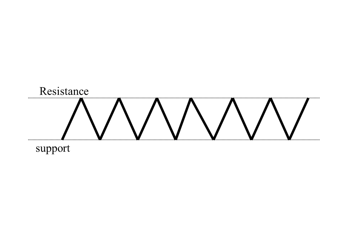
In the stock market, these days of calm are when there is no movement; when the market is in congestion at the end of a price trend before the start of a new one, or between two trends.
Below is the behaviour of the market in three patterns: upwards (1a), downward (1b) , and neutral (1c).
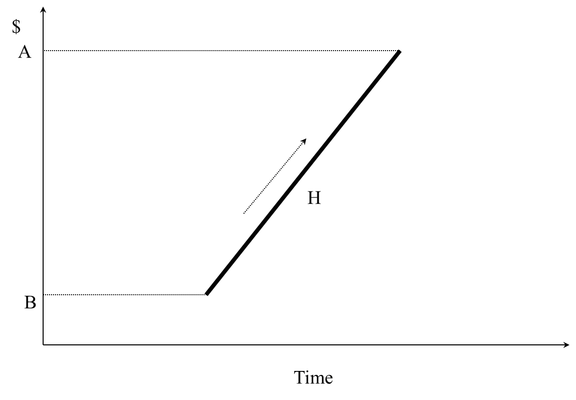
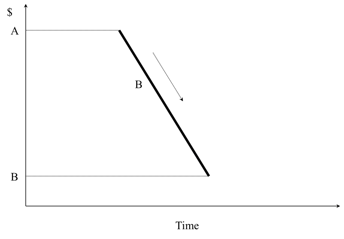
Overall, we get pattern 2.
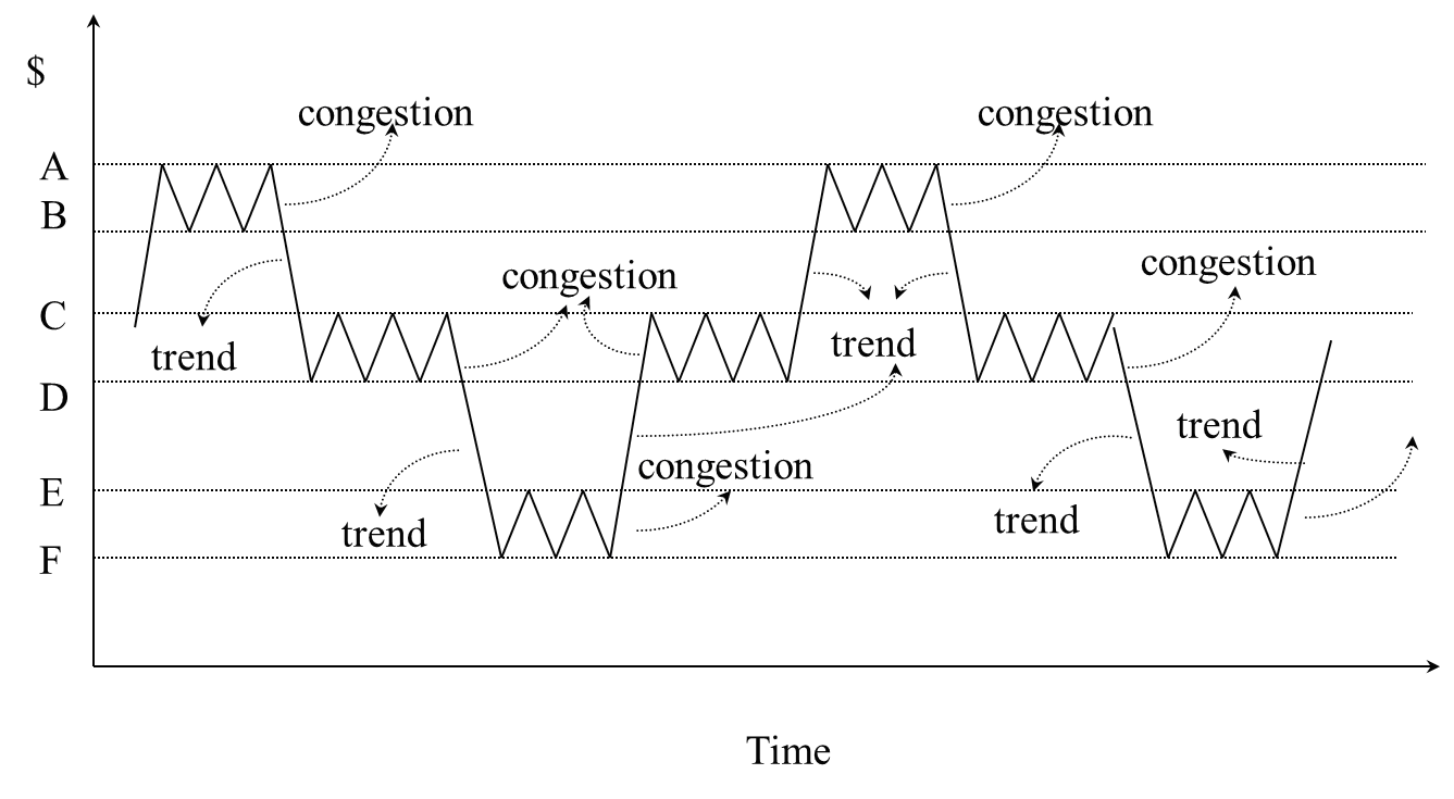
Note that the market can only go up, go down, or be in congestion.
The "days of Alcyone" are periods of congestion. Of course, here the word "day" may indicate any period: a trading session, a week or 2 minutes.
Just look at any chart to see congestion zones. For example, in Chart 1 (weekly) on XSP.to (US SPY ETF, in Canadian dollars) congestion zones are indicated with three circles. This chart shows the XSP over three years and the overall trend is clearly upward. However, there are three stops more or less in 2012, 2014 and 2015.
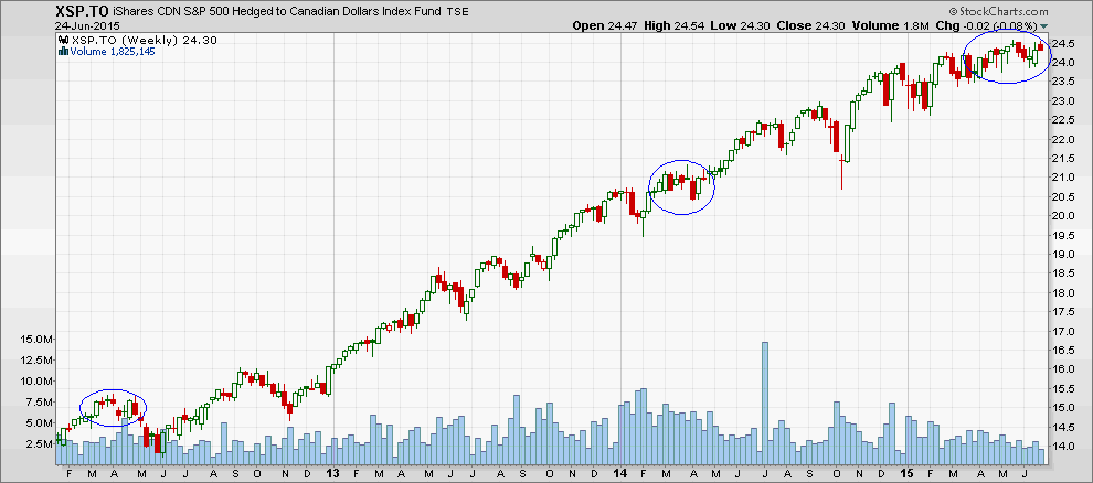 Source : Stockcharts
We may also set aside the direct analysis of a chart and instead use a technical indicator that shows periods of congestion, either at their beginning, their end, or while they occur. This indicator is called "Aroon" whose oriental meaning seems to be "the first light of dawn."
Aroon is formed by two lines. In Chart 2, this is the green line (highs indicator) and the red line (lows indicator). Note their zigzag behaviour.
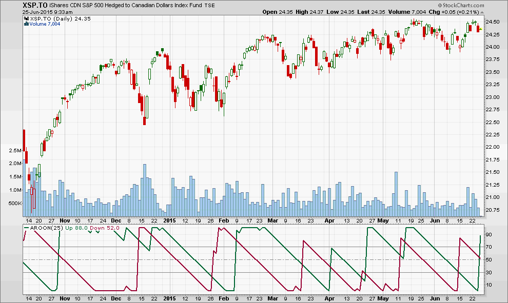 Source : Stockcharts
Aroon is constructed from the following concept: the more recently a new high price is reached, the more likely that the price trend is upward. This concept is illustrated in Pattern 3.
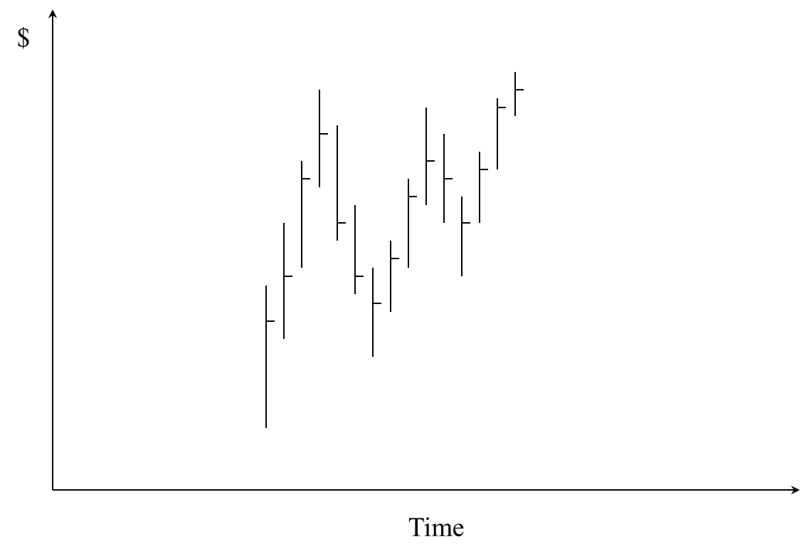
Note in Chart 3 that the last bar on the right reached a high that exceeds the previous high. This indicates, with high probability, a likelihood for prices to exit the apparent congestion and venture upward. In contrast, the more recent a new low price is achieved, the more likely it is that the price trend is in decline.
The Aroon indicator automatically tracks this aspect.
Using this logic, the older the new top, the weaker the uptrend and the more likely that price congestion or a reversal will begin. The older the new bottom, the weaker the downtrend and the more likely that price congestion will occur before a new trend begins. This can be a reversal or a continuation of the last trend down.
How is the Aroon built? The computer examines the ups and downs of the latest 25 periods and calculates Aroon as follows:
Aroon ups = [(25 - number of days from the highest high of the last 25)/25] x 100
Aroon low = [(25 - number of days from the lowest low of the last 25)/25] x 100
Imagine, for example, that today we got the highest price of the last 25 trading days: day zero. The formula will give the following result:
[(25-0) / 25] x 100 = 100%
Now, suppose the highest price was made 25 trading days ago. The calculation will give us zero:
[(25-25) / 25] x 100 = 0%
Whether up or down, it is the same calculation. The conclusion therefore is that when the green line is at 100%, the most recent high of 25 periods took place in the current period and therefore there will likely be an increase in the coming periods.
When the red line is at 100%, the most recent low of 25 periods took place in the current period and therefore prices will likely continue lower.
Where are these "days of Alcyone"? Chart 2 shows a number of occasions where the two lines proceed in parallel from 100% to 0%. These are the days of Alcyone. Why? Because this behaviour indicates that the highest high and the lowest low are receding into the past; they are growing "older". The market is therefore in reflection, not knowing where to go. This is also true if both lines are low, for example less than 30%. However, a new trend appears sooner or later.
And when the two lines cross? The significant moment is when they intersect at around 50%. This means that a new trend is about to be begin: upward when the red line is descending and the green line is rising; downward when the opposite occurs.
The Aroon also applies to 10 minute charts for active trading. Chart 3 (BCE.to) demonstrates this.
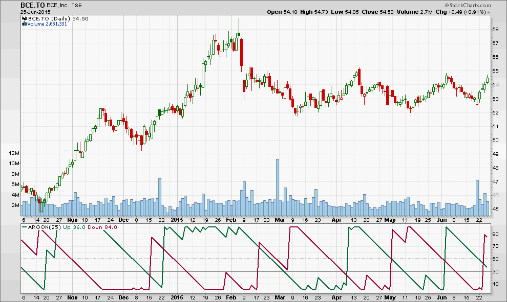 Source : Stockcharts